1 - Critique the visualization
Identify at least three from each evaluation criterion (Clarity and aesthetics)
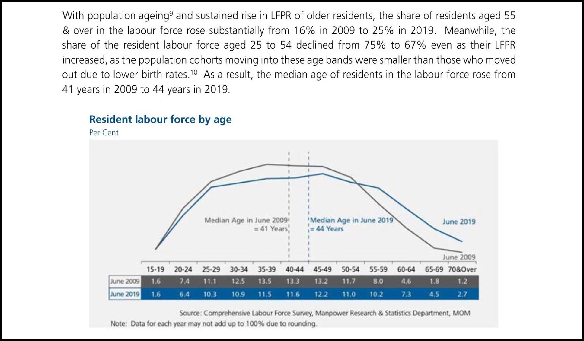
Figure 1: The original data visualization
1.1 Clarity
1.1.1 Unclear title
The title “Resident Labour Force by Age” was used for the visualization. This is unclear and does not inform the reader quickly what the visualization is depicting which is the comparison of labour force by age groups between 2009 and 2019.
Suggestion - Change title
Use the title “Resident Labour Force in Singapore by Age Groups, June of of 2009 & 2019”
1.1.2 Wrong visualization used for the given datatype
Age groups are a categorical datatype. The line graph being used currently is better suited for continuous datatypes.
Suggestion - Change Visualization Type
- Switch to using a bar graph instead of a line graph.
- Ensure Vertical Axis starts at zero
1.1.3 Plotting a median line on categorical scale
Data has already been binned into age groups. There is no way of calculating a discrete median age like 41. If there is a median, it should be the age group of 40-44. i.e. Both groups will have the same median.
Suggestion - Remove the median lines
Mark the bars for 40-44 with a label to show that the median falls within that category.
1.1.4 Percentages can omit context
Using percentages like the Labour force participation rate can omit important contextual information like the true number of people in each age group.
Suggestion - Plot the bar graph with actual numbers instead of percentages
Bar graphs should be sufficient to show the differences in proportions across different categories
1.1.5 Unclear description of percentages points
When comparing percentages across different groups and time periods, the term to be used should be percentage points. While the write up does not use the words percentage change, it can be ambiguous.
Suggestion - Clarify the changes in percentages.
Points being made on changes in percentages such as “Declined from 75% to 67%” can be rewritten as “Declined 8 percentage points from 75% to 67%”.
1.1.6 Write up not aligned with visualization
The opening line of the write up refers to LFPR (Labour Force Participation Rate) whereas the visualization depicts the proportion of labour force. There is no data visualization that readers can refer to while reading statements related to LFPR.The percentages for labour force between 25 and 54 are also not clearly shown.
Suggestion - Include a more visualizations on Labour Force Participation and proportion of labour force.
Use Table 5 on labour force and Table 7 on participation rates to get numbers by age group for labour force participation. Together, the graphs will give a clearer idea of how much labour force participation there is with respect to the resident labour force size. The added visuals will also give view on what is the proportion of resident labour force across age groups.
1.2 Aesthetics
1.2.1 Missing vertical axis and gridlines
Vertical axis is missing, and gridlines are not present on the vertical axis. This can make comparison across different age groups difficult. The units for the vertical axis “Per Cent” is put under the title as well.
Suggestion - Add in missing elements
- Vertical axis should be added to the visualization
- Gridlines and tick marks on the vertical axis should be added
- Label Vertical axis title as “Resident Labour Force (‘000s)”
1.2.2 Good use of Colours
Good consistent (e.g. lines, labels, data table) use of colours to differentiate between 2009 and 2019.
Suggestion - Follow and recreate a similar aesthetic.
Ensure colours and format are replicated across both graphs.
1.2.3 Good use of space and colouring
Following on from point S2, the colours have already well marked out the datapoints and features relating to 2009 and 2019. It would be superfluous to add in a legend.
Suggestion - Follow and recreate a similar aesthetic.
Switching to a grouped bar chart would mean that colors will be important for readers to tell the different categories apart because we will not be able to label the lines the way the original visualization did. Ensure that a legend is included and consistent across both charts.
1.2.4 Missing horizontal axis label
Horizontal axis label is missing. Although it can be inferred based on the categories and the title of the visualization. It would be better if the axis is clearly labelled.
Suggestion - Add in missing elements
- Label horizontal axis title as “Age Groups”
- Gridlines and tick marks will not be needed as visualization will be changed to a bar graph.
2 - A sketch of the improved visualization
With reference to the critics above, suggest alternative graphical presentation to improve the current design. The proposed alternative data visualisation must be in static form. Sketch out the proposed design. Support your design by describing the advantages or which part of the issue(s) your alternative design tries to overcome.
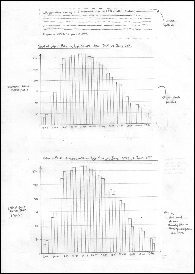
Figure 2: A sketch of the suggested visualizatons
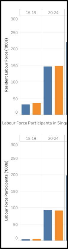
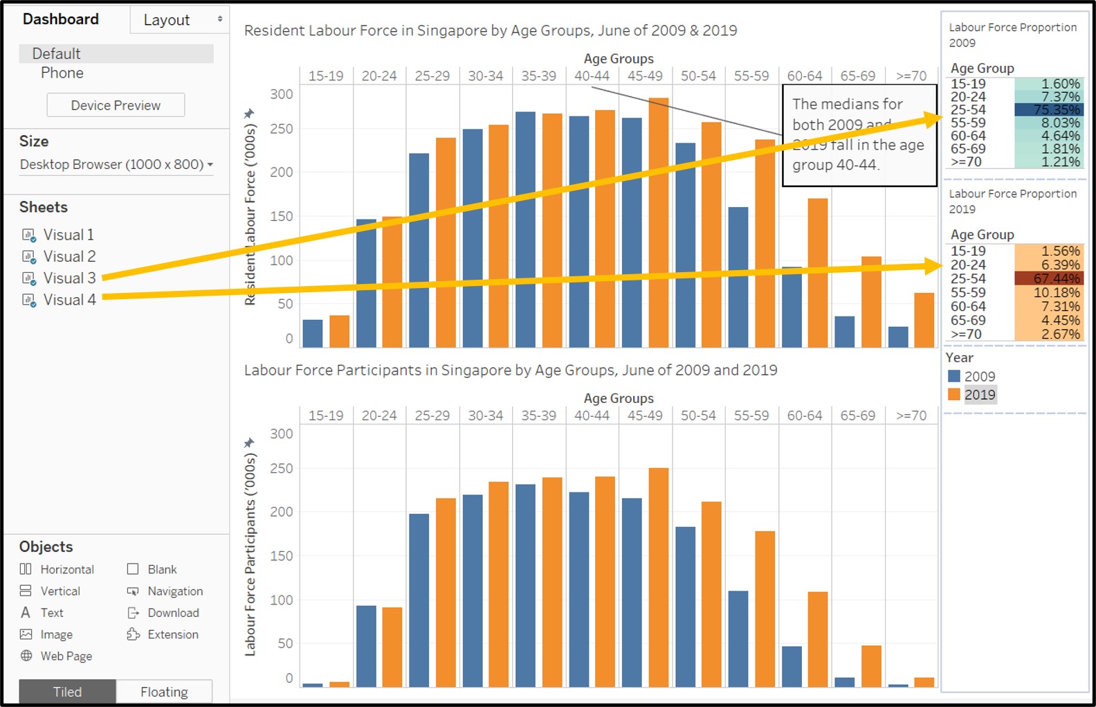
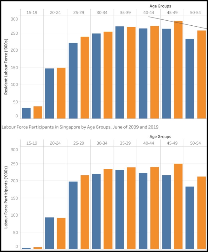
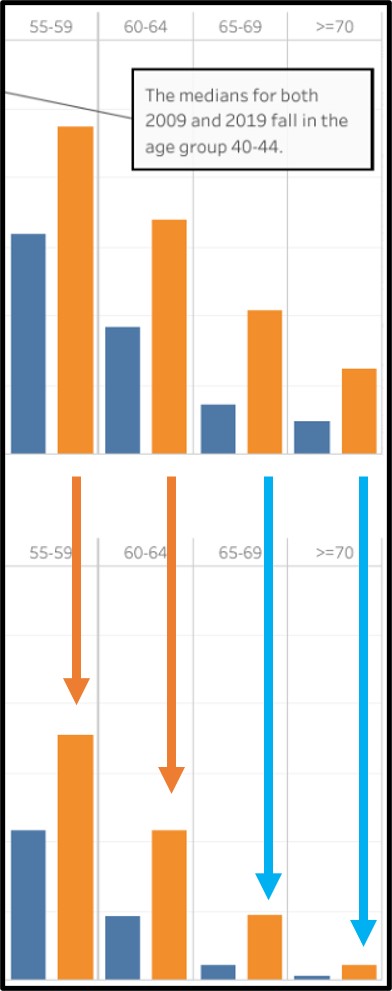
3 - The improved data visualization
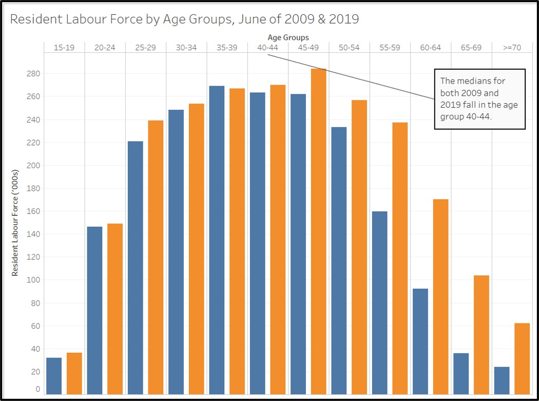
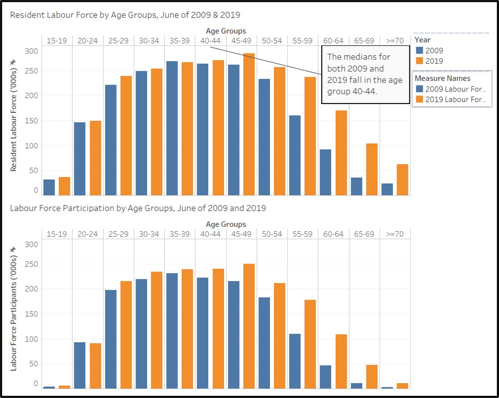
More Older Residents in the Workforce
With population ageing and sustained rise in LFPR of older residents, the share of residents aged 55 & over in the labour force rose 9 percentage points from 16% in 2009 to 25% in 2019. Meanwhile, the share of the resident labour force aged 24 to 54 declined 8 percentage points from 75% to 67% even as their LFPR increased, as the population cohorts moving into these age bands were smaller than those who moved out due to lower birth rates. While the median age of residents in the labour force stayed in the 40-44 year old age group from 2009 to 2019, it is likely that the median age will soon shift up to the 45-49 year old age group as the population ages further.
Figure 3: The improved data visualization
The link to the original dashboard on Tableau Public Server can be found here.
4 - The data preparation process
Provide step-by-step description on how the data visualization was prepared.
4.1 Data Sources Used:
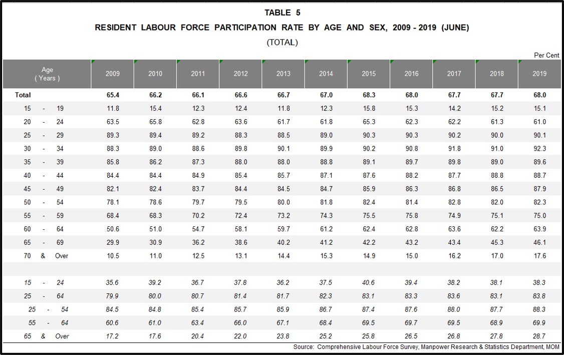
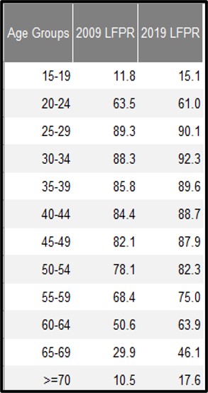
- RESIDENT LABOUR FORCE AGED FIFTEEN YEARS AND OVER BY AGE AND SEX, 2009 - 2019 (JUNE) - Table 7
- RESIDENT LABOUR FORCE PARTICIPATION RATE BY AGE AND SEX, 2009 - 2019 (JUNE) - TABLE 5
4.2 Steps taken for first Visualization
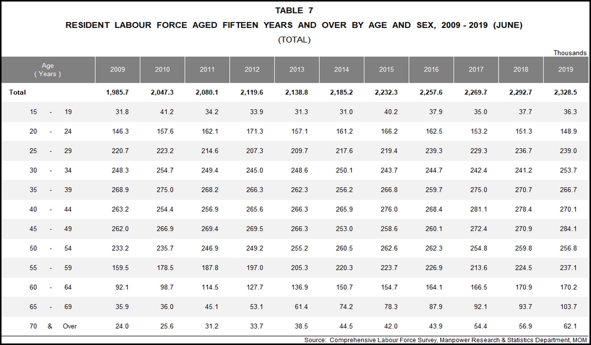
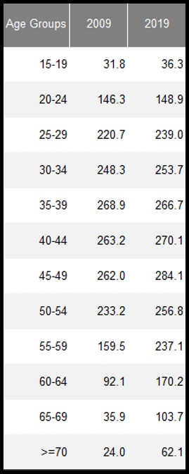
Using the (TOTAL) sheet in table 7 (mrsd_2019LabourForce_T7.xlsx), select and preserve only the required data. i.e. Age groups, 2009 and 2019. Delete all other rows (including the total row) and columns (and blank columns).
Rename “Age (Years)” to “Age Groups”
Remove whitespaces in data. e.g. “15 - 19” to “15-19” and “70 and over” to “>=70” to maximise use of space.
- Save the excel file,create a new Tableau workbook and load the file (mrsd_2019LabourForce_T7.xlsx) into Tableau. Ensure that the datasheet (T7_T) is loaded correctly and the datatypes are correctly identifed by tableau.
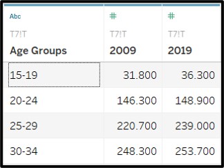
Switch to Sheet 1 and rename it “Visual 1” in Tableau
Drag Age Groups into columns and 2009 / 2019 into rows as seen in the screenshot below.
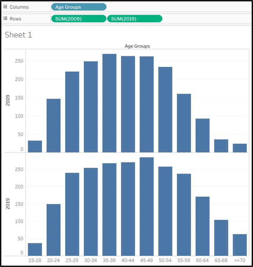
- Drag the values for 2019 on the same vertical axis where the 2009 values are plotted.
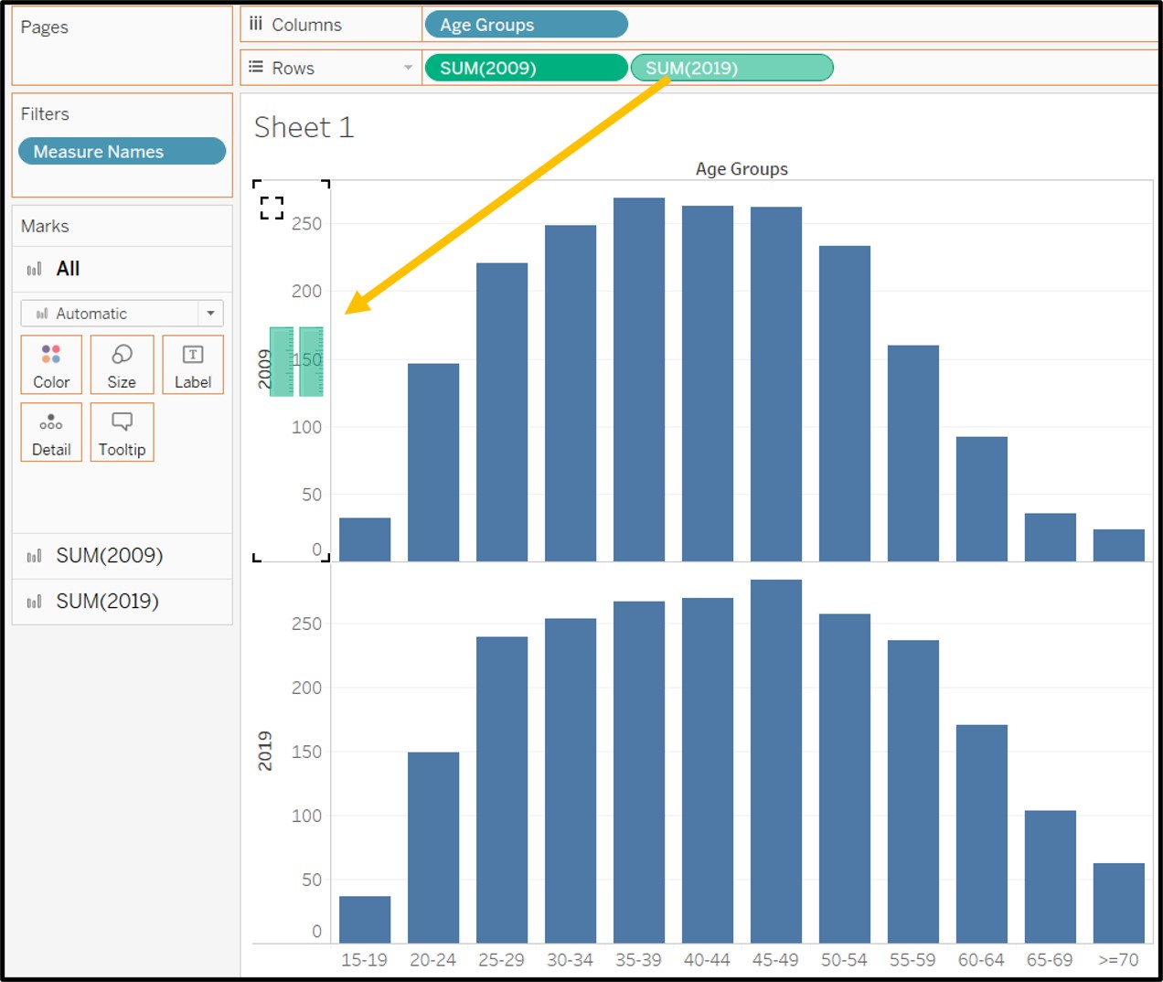
- Drag measure names onto color in order to add color to the grouped bar chart. The bars are now color coded by year.
Hide the headers showing 2009 and 2019 at the bottom of the bar chart as they are no longer necessary.
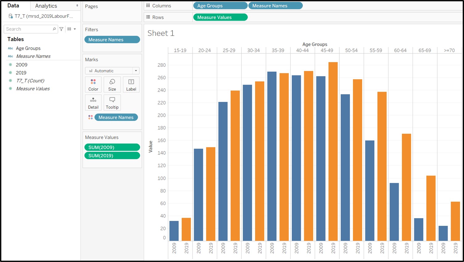
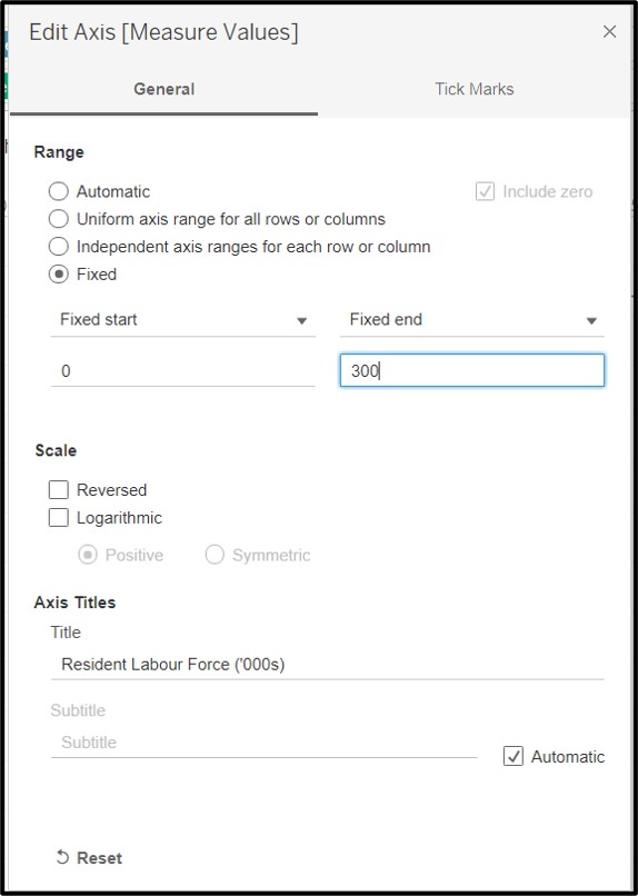
Rename vertical axis and include units: “Resident Labour Force (’000s)”
Add in an annotation to indicate the median group which is 40-44 for both 2009 and 2019.
Rename visualization to: “Resident Labour Force by Age Groups, June of 2009 & 2019”
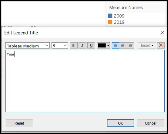
- Rename the title of the legend from Measure Names to Year
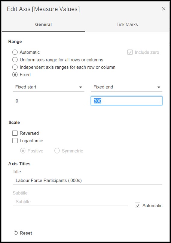
- Finally, set the axis range to be from 0 to 300 so that sizes of the bars can be compared across both visualizations.
4.3 Steps taken for second Visualization
Similarly, using the (TOTAL) sheet in table 5 (mrsd_2019LabourForce_T5.xlsx), select and preserve only the required data. i.e. Age groups, 2009 and 2019. Delete all other rows (including the total row) and columns (and blank columns).
Rename “Age (Years)” to “Age Groups”
Remove whitespaces in data. e.g. “15 - 19” to “15-19” and “70 and over” to “>=70” to maximise use of space.
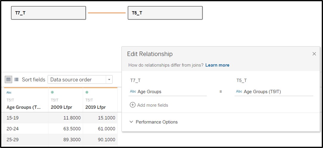
Save the excel file and load it (mrsd_2019LabourForce_T5.xlsx) into the same Tableau workbook. Drag the new required datasource (T5_T) into use.
Ensure that the datasheet (T5-T) is loaded correctly and the datatypes are correctly identifed by tableau.Also ensure that the relationship between T5_T and T7_T is correctly identifed. i.e. Using the Age Group columns in both datasets to create a relationship.
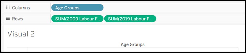
Create a new sheet in the Tableau workbook and rename it “Visual 2”.
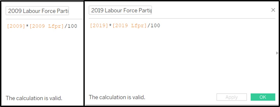
From the data fields available. Create two new calculated fields to find the number of participants in the labour force in each year. Name them as “2009 Labour Force Participants” and “2019 Labour Force Participants”. The equation is shown below.
- Drag Age Groups into columns and 2009 Labour Force Participants / 2019 Labour Force Participants into rows as seen in the screenshot below.
- Drag the values for 2019 Labour Force Participants on the same vertical axis where the 2009 Labour Force Participants values are plotted.
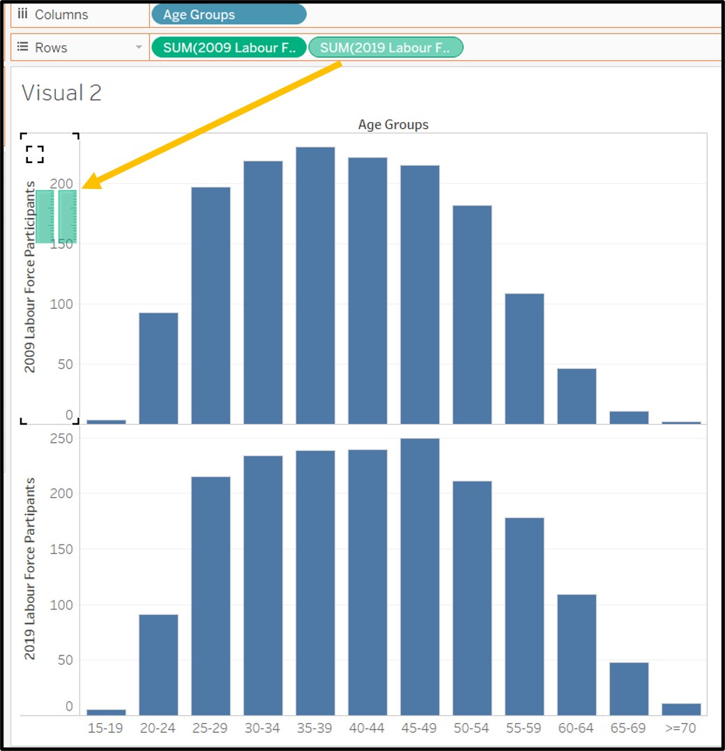
Drag measure names onto color in order to add color to the grouped bar chart. The bars are now color coded by year.
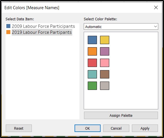
Ensure that the colors are consistent with visual 1. Blue for 2009 and Orange for 2019.
Hide the headers showing 2009 Labour Force Participants and 2019 Labour Force Participants at the bottom of the bar chart as they are no longer necessary.
Rename vertical axis and include units: “Labour Force Participants (’000s)”
Rename visualization to: “Labour Force Participants by Age Groups, June of 2009 & 2019”
Finally, set the axis range to be from 0 to 300 so that sizes of the bars can be compared across both visualizations.
4.4 Steps taken for third visualization
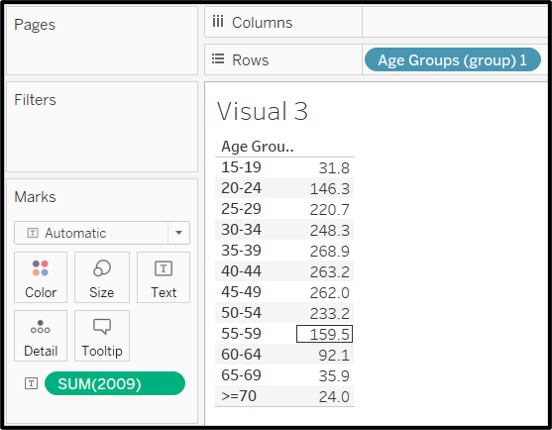
Create a new sheet in the Tableau workbook and rename it “Visual 3”.
Drag Age Groups into rows and resident labour force size 2009 from T7_T into Text
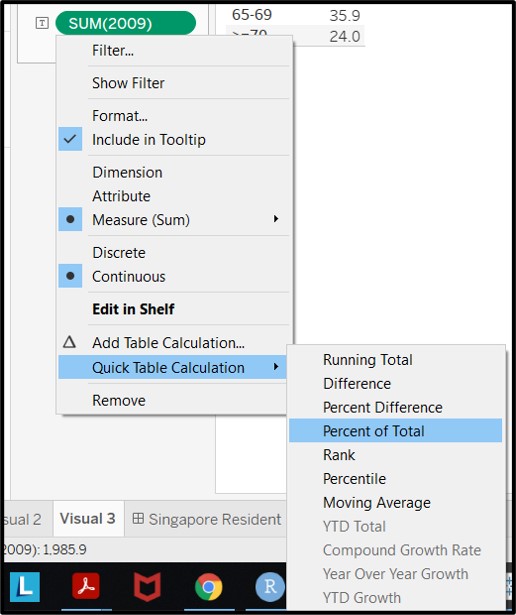
- Change the values of 2009 labour force size into a quick table calculation as Percentage of Total
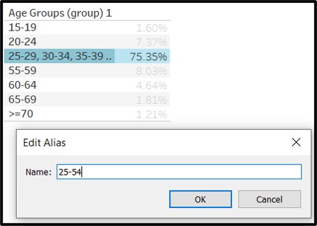
- Group the values for 25-29,30-34,35-39,40-44,45-49,50-54 together
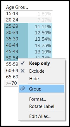
- Edit the group name to be 25-54
- Change visual into a Highlight Table. Select Range of highlight color to be blue for 2009, aligned with the rest of the visuals.Rename column header to age group.
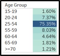
Rename visual to Labour Force Proportion 2009
Redo all the steps to create a fourth visual for proportion of resident labour force in 2019 and using orange as the colour for the highlight table.
4.5 Pulling it all into a dashboard
Create a new dashboard and name it “Singapore Resident Labour Force and Participants 2009 vs 2019”
Drag Visual 1 and Visual 2 onto the dashboard canvas in a top and bottom layout.
Reduce font size of chart titles to 10 to give more screen space to the charts.
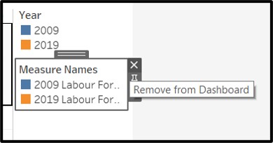
- Remove one of the legends from the dashboard as the legend is designed to be consistent across both charts.
- Update the title of the respective charts to
- “Resident Labour Force in Singapore by Age Groups, June of of 2009 & 2019”
- “Labour Force Participants in Singapore by Age Groups, June of 2009 & 2019”
- Pull in Visuals 3 and Visuals 4 to fill in the whitespace near the legend and shift the legend downwards
- Publish to Tableau Public Server
5 - New insights
Describe three major observations revealed by the data visualisation prepared.
5.1 25-54 year olds are the most active in the labour force
Workforce participation for 25 to 54 year olds is the highest and consistently above 80%. These groups form the biggest part of the residential workforce and also participate the most. This is important for Singapore’s economy as its biggest group of workers are consistently and actively participating in positive economic activity. This is also something to be concerned about, as this group of workers age, their workforce participation is likely to mirror that of the current older age groups. If this group of residents (the largest group) turn older and stop partcipating, it will have grave consequences for Singapore’s economy and signals the need for rejuvenation.
5.2 Workforce participation changes significantly from 65
The workforce participants in each age group usually account for the majority of resident workforce (i.e. >50% as seen by the orange arrows). This is true until the age group of 65-69 (as marked out by the blue arrows). From here on, the work force participation drops significantly and goes below 50%. This is in line with what we can expect from Singapore’s offcial retirement age, currently set at 67 years old. With the retirement age expected to be raised till 70 years old in by 2030, the workforce participation picture is likely to change significantly from what we are seeing now.
5.3 Insufficient young workers to replace old workers
As can be clearly seen, large numbers of the workforce are growing old and retiring from the workforce. This means that a younger generation has to take over. The numbers of younger workers (15-24 year olds) have been stagnating from 2009 to 2019. This is to be expected from the low birth rates seen in Singapore, which also explains the need for influx of foreign workers to supplant the requirements of the economy.